In exploratory data analysis (EDA), we often calculate correlation coefficients and present the result in a heatmap. Correlation coefficient measures the statistical relationship between two variables. The correlation value represents how the change in one parameter would impact the other, e.g. quantity of purchase vs price. Correlation analysis is a very important concept in the field of predictive analytics before building the model.
But how do we measure statistical relationship in a spatial dataset with geo locations? The conventional EDA and correlation analysis ignores the location features and treats geo coordinates similar to other regular features. Exploratory Spatial Data Analysis (ESDA) becomes very useful in the analysis of location-based data.
Spatial Autocorrelation
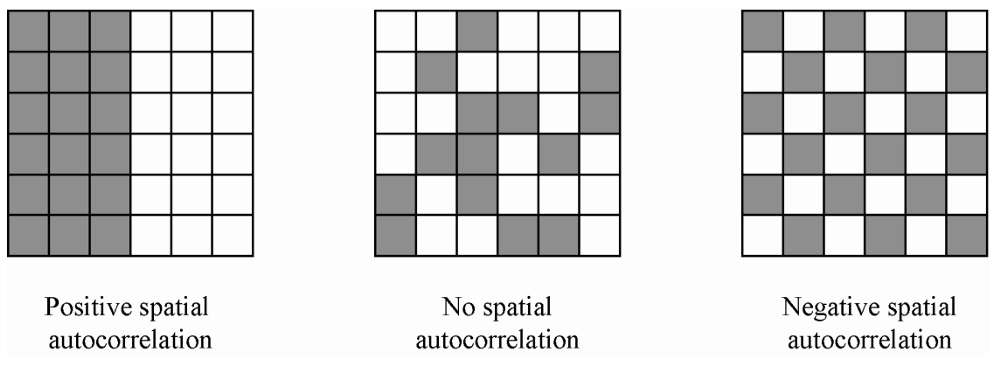
ESDA is intended to complement geovizualization through formal statistical tests for spatial clustering, and Spatial Autocorrelation is one of the important goals of those tests. Spatial autocorrelation measures the correlation of a variable across space i.e. relationships to neighbors on a graph. Values can be
- positive: nearby cases are similar or clustered e.g. High-High or Low-Low (left image on the figure below)
- neutral: neighbor cases have no particular relationship or random, absence of pattern (center image on the figure below)
- negative: nearby cases are dissimilar or dispersed e.g. High-Low or Low-High (right image on the figure below)
The two most commonly-used measures of spatial autocorrelation are spatial similarity and attribute similarity.
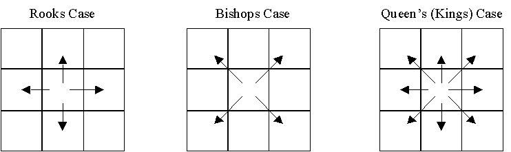
Spatial similarity is a representation of the spatial structure of a dataset by quantifying (in spatial weights) the relative strength of a relationship between pairs of locations. Neighborhood relations are defined as either rook case, bishop case or queen (king) case – see the figure below. These are rather simple and intuitive as the names suggest. You can read Contiguity-Based Spatial Weights for more in-depth explanation of spatial weights.
On the other hand, attribute similarity, measured by spatial lags, is obtained for each attribute by comparing the attribute value and its neighbors. The spatial lag normalizes the rows and takes the average value in each weighted neighborhood.
Load Dataset
We use Toronto Airbnb listings in 2020/12 as our main dataset. We also grab Toronto neighborhoods Polygon dataset so that we can map our spatial listing data points to different areas. Our goal is to investigate if there is any spatial correlation in Airbnb average listing price between neighborhoods, i.e. hot area, cold area, or random.
The following Python libraries are used for manipulating the geo data:
- GeoPandas for geodata storage and manipulation
- PySAL for spatial computation and analysis
- Folium for creating interactive geovisualization.
Examples of Airbnb listings
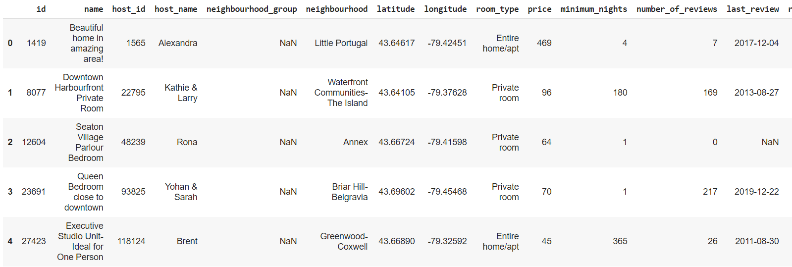
Airbnb data needs to be converted to GeoDataFrame. We need to define the CRS (Coordinate Reference Systems) with the dataset. We use EPSG:4326, which defines latitude and longitude coordinates on the standard (WGS84) reference ellipsoid.
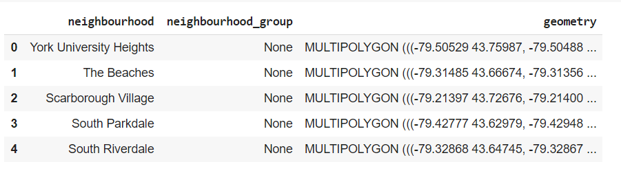
data_gdf = gpd.GeoDataFrame(data_orig, geometry=gpd.points_from_xy(data_orig.longitude, data_orig.latitude), crs='EPSG:4326')In total there are 140 neighborhoods in Toronto. Coordinates in the geometry column defines multi-polygon boundaries of the neighborhood. Here are some examples:
Next, we want to find out the average price per night for each neighborhood. Given the latitude/longitude coordinate of the listings and polygon boundaries of the neighborhood, we can easily join the two datasets using the sjoin function provided in GeoPanda.
temp = data_gdf[['price','geometry']]
listing_prices = gpd.sjoin(nbr_gdf, temp, op='contains')
listing_prices.head(5)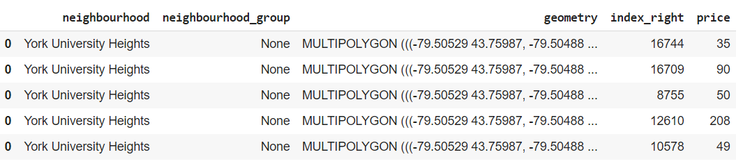
Here we use op='contains' in sjoin, meaning we want the records from the left DataFrame (i.e. neighborhood data) that spatially contain geo records from the right DataFrame (i.e. listing data). In the result dataset, column index_right is the index from the listing records and price is the corresponding list price.
We take the average of listing prices per neighborhood, and here is the aggregated dataset:
nbr_avg_price = listing_prices['price'].groupby([listing_prices['neighbourhood']]).mean()
nbr_final = nbr_gdf.merge(nbr_avg_price, on='neighbourhood')
nbr_final.rename(columns={'price': 'avg_price'}, inplace=True)
nbr_final.head()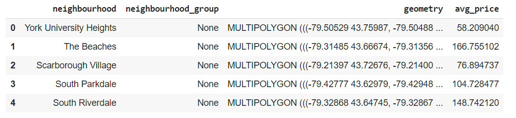
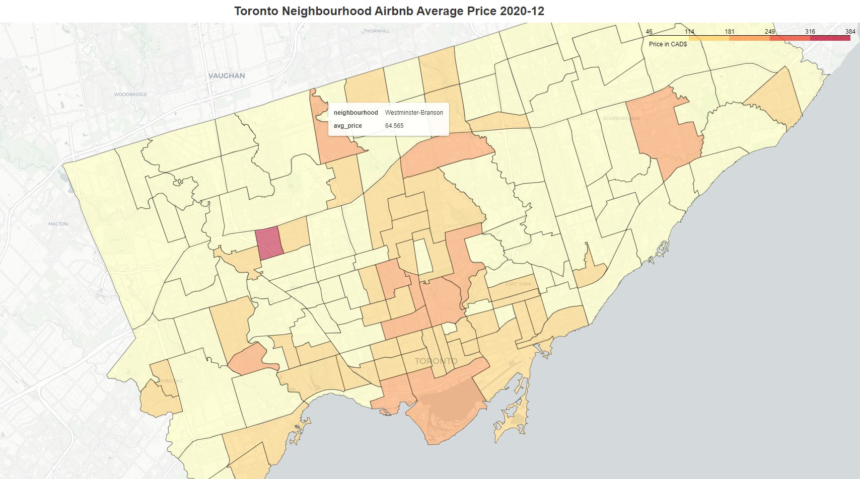
We create an interactive Choropleth map using Folium. You can see the average listing price when hover over the neighborhood.
So far so good. Although we can visually see which neighborhoods have listings with higher or lower price, it is not quite obvious to tell if there is any spatial pattern and what the patterns are, given the irregular polygons of different sizes and shapes. Spatial autocorrelation is a good solution for answering the question.
Spatial Weights
As the aforementioned, to investigate spatial autocorrelation we need to compute spatial weights. We use PySal library for the calculation. Here we use the Queen contiguity for spatial weights.
w =  lps.weights.Queen.from_dataframe(nbr_final)
w.transform = 'r'
Global Spatial Autocorrelation
Global spatial autocorrelation determines the overall clustering in the dataset. If the spatial distribution of the listing price was random, then we should not see any clustering of similar values on the map. One of the statistics used to evaluate global spatial autocorrelation is Moran’s I statistics.
y = nbr_final.avg_price
moran = esda.Moran(y, w)
moran.I, moran.p_sim

(0.23066396579508366, 0.001)
Moran’s I values range from -1 to 1, and 1 indicates a strong spatial autocorrelation. In our example, we have a Moran’s I value 0.23 and p-value of 0.001 which is considered statistically highly significant. Therefore, we would reject the null hypothesis of global spatial randomness and in favor of spatial autocorrelation in listing prices. We can also visualize this on a Moran’s I plot.
plot_moran(moran, zstandard=True, figsize=(12,6))
plt.tight_layout()
plt.show()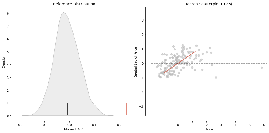
Local Spatial Autocorrelation
The global spatial autocorrelation analysis is great for telling if there is a positive spatial autocorrelation between the listing price and their neighborhoods. But it does not show where the clusters are. The Local Indicators of Spatial Association (LISA) is intended to detect the spatial clusters and put them in 4 categories:
- HH – high values next to high
- LL – low values next to low
- LH – low values next to high
- HL – high values next to low
We calculate the Moran Local score.
m_local = Moran_Local(y, w)Plot it using Moran’s scatterplot.
P_VALUE = 0.05
fig, ax = plt.subplots(figsize=(10,10))
moran_scatterplot(m_local, p=P_VALUE, ax=ax)
ax.set_xlabel('Average Price')
ax.set_ylabel('Spatial Lag of Avg Price')
plt.text(1.35, 0.5, 'HH', fontsize=25)
plt.text(1.65, -0.8, 'HL', fontsize=25)
plt.text(-1.5, 0.6, 'LH', fontsize=25)
plt.text(-1.3, -0.8, 'LL', fontsize=25)
plt.show()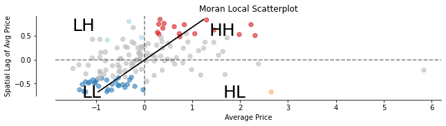
Now let’s plot the LISA results in a map using the lisa_cluster function.
fig, ax = plt.subplots(figsize=(12,10))
lisa_cluster(m_local, nbr_final, p=P_VALUE, ax=ax)
nbr_final.boundary.plot(ax=ax)
plt.title('Toronto Airbnb Neighbourhood Average Price Spatial Lag Choropleth Map 2020-12')
plt.tight_layout()
plt.show()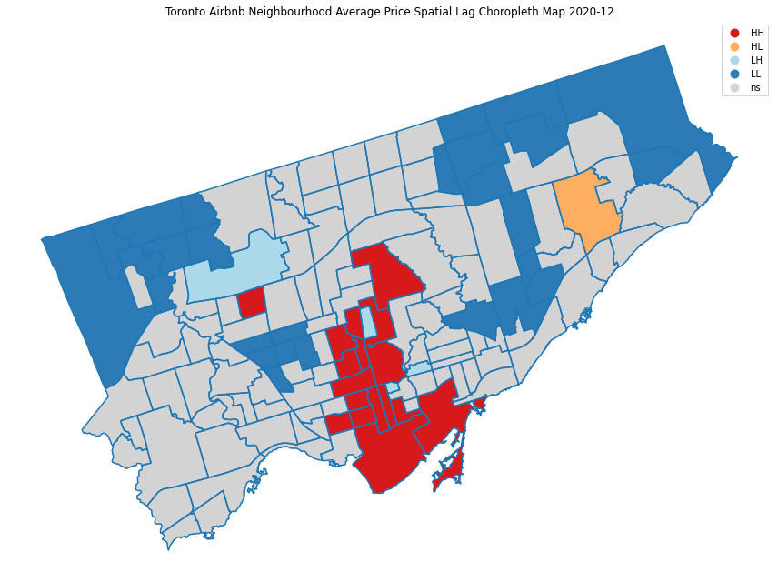
Neighborhoods in red are areas that have high prices with high prices in nearby neighborhoods (HH). Blue colors show areas that have low prices surrounded by low prices (LL). It is also interesting to notice the yellow and light blue colors show the areas that have big price differences from their neighborhoods (HL and LH). You can use the interactive neighborhood price map above to verify the LISA categorization.
After some further investigation, it seems there is a listing in the Rustic neighborhood (the red block surrounded by gray) with a price $2,000, much higher than the average of the area $60. It could be a data issue, or a different type of property.
Closing Notes
Using the spatial autocorrelation analysis, we analyze the global and local spatial autocorrelation of Toronto Airbnb prices in relation to their nearby neighborhoods. A LISA analysis is very useful to identify statistically significant clusters of high values and detect outliers. It can help in many geo-based data analysis, including social, economic, epidemiological studies.
All codes can be found on Google Colab.
Happy Machine Learning!